
Table of Contents
- The Importance of UI Component tools in Application Design
- Introducing: Storybook
- The strengths of Storybook
- The weaknesses of Storybook
- Introducing: Bit
- Similarities between Storybook and Bit
- Differences between Storybook and Bit
- Advantages and Disadvantages of Bit and Storybook
- Storybook and Bit use cases
- Storybook or Bit: Which tool do I use?
- Can I use Storybook and Bit together?
- Conclusion
Wondering what the difference is between Storybook and Bit? This article breaks it down for you, so you can choose the right tool for your project.
Sometimes, old solutions don't stand the test of time. After revisiting my earlier post about connecting these tools together, it's become clear that this approach can be a slippery slope packed with pitfalls!
Storybook and Bit may seem like peas in a pod, but the truth is- these two tools have as much difference as chalk has from cheese! In this article, we'll break down component-driven software like Storybook and Bit and just what sets them apart, exploring their features and capabilities to define which tool best suits your specific project needs - so that by the end, you can finally make an informed choice between Storybook vs. Bit: The Final Showdown!
The Importance of UI Component tools in Application Design
Tools are a lifesaver for UI component development: they enable developers to work smarter, faster, and more effectively. A great toolkit can not only cut down on design time but also help craft stellar user experiences - making it easier than ever to collaborate with team members and keep tabs on evolving changes in the components we create.
With so many different UI component tools out there, it can be hard to choose the one that's right for you. Luckily, Bit and Storybook are here to make life easier! Both offer powerful features specifically tailored toward developers who need help managing their application's components - whether that means creating them from scratch or maintaining existing ones.
Introducing: Storybook
Storybook is the perfect place for developers to bring their components to life. It's an open source tool and development environment that makes it straightforward and efficient to create, test, document, and debug individual elements in splendid isolation - all while providing an easy-to-use interface where you can get up close with your work! Plus, Storybook supports multiple frameworks/libraries like React, Angular & Vue, so no matter what tools you prefer, there are plenty of options available - plus, its expansive community offers both support and plugins if needed.
The strengths of Storybook
For those without Storybook, component libraries can be a hefty endeavor! Keeping yours up-to-date and organized requires immense manual effort - almost too much to bear. Thankfully, tooling like Storybook makes it all worthwhile. Let's look at a few reasons why.
Isolation
Storybook provides an invaluable service for developers, allowing them to create and manage components safely and debug issues in isolation. This means that each component in your component library can be tested individually without the worry of being adversely affected by the behavior of parts elsewhere in the application - all within a dedicated development environment tailored specifically for this purpose!
In Storybook, you write stories that describe your module. You can create the story as you develop your component in isolation. The resulting story will be added to an interactive development UI framework. That could look like this:
import React from 'react';import { storiesOf } from '@storybook/react';import { Button } from './Button';
storiesOf('Button', module)  .add('with text', () => <Button>Hello Button</Button>)  .add('with emoji', () => (    <Button>      <span role="img" aria-label="so cool">        😀 😎 👍 💯      </span>    </Button>  ));
This is using the old storiesOf story files format. New versions of Storybook provide a more complete approach. Specifically, this is an example of using React components within Storybook.
Testing
Storybook provides an invaluable service to developers, allowing them to develop and test components in a private sandbox where they can accurately identify any potential issues. The variety of testing options available makes it much easier for devs to pinpoint and resolve bugs before moving their code into production - saving time and money!
Unit Testing
With Storybook’s support for unit testing frameworks such as Jest, Mocha, and Jasmine – developers have the perfect opportunity to ensure their individual components are functioning optimally. Doing so allows them greater confidence when developing new features that depend on existing modules - all thanks to those vital tests!
Snapshot Testing
Storybook brings developers a powerful tool in snapshot testing, allowing them to easily detect unexpected changes and avoid regressions. Simply take a "snapshot" of the output from any component, then compare it with previous versions - an efficient way to keep your code safe!
Integration Testing
Storybook does more than provide developers with a platform to test their components. It also provides an invaluable tool for troubleshooting, allowing users to simulate various scenarios and interactions that could result in unexpected issues arising from the integration of components into applications.
Automation (CI/CD)
Storybook helps developers streamline their release cycle by empowering them to detect and resolve any issues or bugs at the earliest possible stage. This integration with CI/CD automation not only saves time but also leads to a frictionless development process.
Check out the documentation for some in-depth info about testing and automation in Storybook.
Collaboration
Storybook is a powerful collaboration platform for developers and teams, helping them build component libraries with ease. From full documentation to easy-to-follow usage instructions, it streamlines the process of creating components that everyone on the team can use and understand!
Sharing
Storybook is an invaluable tool for developers, helping them quickly and easily collaborate with their team members as well as other stakeholders in order to create richer design experiences. With the ability to share components across multiple projects, Storybook makes it simple to reuse individual elements - allowing creativity without wasting time reinventing wheels!
Documentation
Storybook offers an invaluable service to developers, helping them quickly and easily document usage instructions for components included in their libraries. This streamlines understanding of how things work across projects and teams, resulting in increased consistency - plus fewer headaches!
Versioning
Storybook provides a helpful solution for developers by allowing them to version components, enabling easy tracking of changes and quick rollbacks. This makes collaboration on components much simpler - teams are able to work together or even concurrently on different versions with ease!
Customization
Storybook's flexibility and open plugin architecture make it the perfect tool for developers looking to get creative. With Storybook, you can customize every aspect of your project - from integrations to code style preferences - allowing you to create unique solutions with ease!
Add-ons
Storybook has taken customization to a whole new level with its unique add-ons. These powerful plugins give developers the ability to personalize the tool in a variety of ways, from adding custom controls and UI elements to linking Storybook up with other apps. It's an invaluable feature for taking your design process even further!
The amazing Knobs addon enables developers to simulate a variety of different props and states, so they can observe how the component responds. To help illustrate its use - here's an example!
import { withKnobs, text } from '@storybook/addon-knobs';
storiesOf('Button', module)  .addDecorator(withKnobs)  .add('with text', () => {    const label = text('Label', 'Hello Button');    return <Button>{label}</Button>;  });
This is using the old storiesOf format. New versions of Storybook provide a more complete approach.
Custom UI
Storybook is the perfect tool for developers looking to create a unique and personalized UI! By utilizing custom styling options like CSS, they are able to craft an interface that matches their precise design standards while also complementing the existing application aesthetic.
Community Plugins and Integrations
Storybook's community offers a supportive environment packed with helpful documentation and tools. With its collection of user-generated plugins and integrations, developers can quickly find the exact feature they need for their projects.
Development Environment
Storybook lets developers keep everything in one handy spot and test quickly - it's the ultimate gateway for effortless navigation!
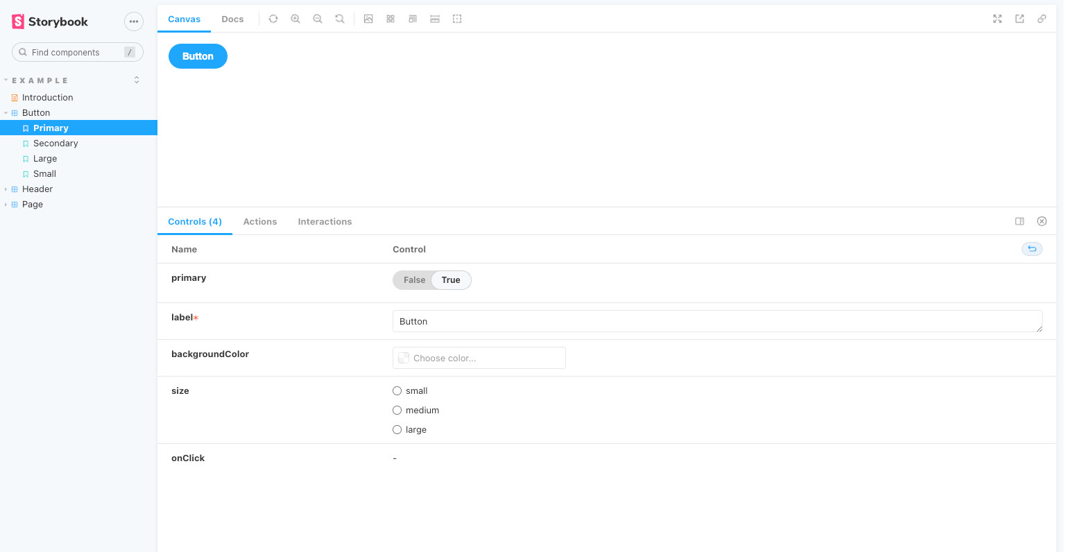 Storybook development UI
Storybook revolutionizes the dev experience with a user-friendly UI that sets developers up for success. It's like an interactive toolkit, giving you easy access to components and features via its intuitive elements.
The weaknesses of Storybook
While Storybook is a tried-and-true go-to for UI development, it's not without its drawbacks. For instance, certain features can limit the reach of your project or require complex workarounds. To ensure you get the maximum benefit from this toolset and don't fall prey to common errors when using it, familiarize yourself with these areas first!
Complexity
Complexity can be an enemy of efficiency, and as libraries grow with more components, it becomes increasingly difficult to manage them all in Storybook. Without careful attention, this situation could lead to unnecessary duplication and wasted time - a classic case where less is definitely more!
Limited framework support
Storybook is no stranger to the popular tools, having comprehensive compatibility with a vast array of frameworks and libraries. But, although its active community provides valuable support and resources for users, there are still some challenges in fully leveraging all these technologies - potentially making it tricky to get Storybook running optimally.
Limited support for deployment
Storybook provides a great platform for developers to quickly test and troubleshoot their code but does not offer many solutions when it comes time for deployment into production.
Introducing: Bit
Bit is revolutionizing how developers collaborate, enabling them to turn any snippet of code into a reusable asset - perfect for sharing and reusing in different teams or projects. Its comprehensive platform allows coders to discover new components from within your component library, test their quality assurance, and organize what they need with ease! Put simply: Bit acts as the connective tissue that helps bring your development team's ideas together like never before.
Sharing
Bit makes life easier for developers by creating a centralized hub where all components can be shared and reused across projects, making collaboration on designs between team members a breeze!
The centralized hub is a revolutionary way of making collaboration amongst development teams easier, enabling developers to share and organize their code components in one central repository. Not only does this minimize the time wasted on repetitive tasks, but it also allows for different versions of their code modules to evolve alongside each other - maximizing productivity levels across many projects!
With the help of this streamlined, centralized hub, developers can now reach out to teams outside their own and enable effective communication channels for feedback. Furthermore, it provides a highly organized system that allows devs to find existing components in the shared components repository and craft new ones with a collaborative effort.
Collaboration
Bit allows developers to collaborate and share code components easily in one location, significantly reducing development time. With an easy-to-use platform for creating, testing, sharing, and discovering reusable pieces of code, developer teams can fast-track their projects with improved efficiency from these shared resources - making collaboration easier than ever before!
With the platform, developers can benefit from component versioning. This allows for seamless collaboration between teams and even simultaneous development of multiple versions at once. It also encourages open communication by making it simple to share components through a library with stakeholders or anyone interested in reviewing them.
Deployment
Bit simplifies the complex task of deploying code components and helps developers automate their development pipeline with its CI/CD integration feature. By catching glitches earlier in the process and performing rigorous testing before deployment to production, teams can work confidently, knowing that they are delivering secure products while decreasing time-to-market.
Deploying components starts with creating a new one, documenting it, and testing for compatibility. Once the component passes all tests, it can be exported to an environment like development or production via CI/CD pipelines in order to automate deployment. Bit lets developers version-control these components so teams can effectively collaborate on them while also allowing multiple versions of a single component at once for easy tracking & rollback if needed.
Each deployed component becomes its own dedicated package that can be imported via a package.json file and versioned as you would normally version a package for a JavaScript project.
Here's an example of the commands necessary to check in and deploy a component using Bit:
# Initialize a new bit workspace$ bit init
# Track a component$ bit add src/components/button
# Tag the component and give it a version$ bit tag --annotate 1.0.0 "Initial version"
# Export the component to bit.dev$ bit export user.components/button
# Now the component is available on bit.dev and can be shared, collaborated on and versioned.
To initialize a new bit workspace, the command bit init will get you up and running. Then, tracking your components becomes easy with the use of bit add. You can mark them with version numbers like 1.0.0 or higher to denote certain stages in its development cycle, along with an annotation for easier referencing later on! Once done tagging it, exporting is just as simple by using bit export. Now that component has become available for other fellow developers to consume via bit-dev, making collaboration & versioning quickly achievable!
To get the most out of your Bit account, be sure to log in before running any commands; remember to also modify the username section within bit export user.components/button with your own credentials!
Similarities between Storybook and Bit
Storybook and Bit are both powerful tools for working collaboratively on reusable code components, streamlining the entire development process. These platforms offer a convenient way to create, test, and even share your custom structures with others - all while ensuring teams can more easily pitch in towards improving these projects over time. So if you're looking for an efficient platform designed specifically with collaborative coding of libraries/components in mind, Storybook & Bit have you covered!
Here are a few specific ways that Storybook and Bit are similar:
- Provide a centralized environment for developing, testing, and documenting components.
- Allow developers to isolate components and work on them in isolation.
- Allow developers to collaborate on the development of components.
- Let developers automate the process of building, testing, and deploying components by integrating with the CI/CD pipeline.
- Allow developers to share and discover components.
- Allow developers to version the components, so it's easy to track changes and roll back if needed.
- Allow developers to integrate with other tools, such as GitHub and GitLab.
Differences between Storybook and Bit
Storybook and Bit offer unique capabilities for streamlining the process of creating, testing, and sharing components of code - but they are used in different ways. Storybook provides a powerful development space to create UI elements from scratch, while Bit is more about organizing existing libraries so that developers can discover useful pieces for their projects quickly and easily.
Here are a few specific ways that Storybook and Bit are different:
- Storybook is primarily focused on UI components, while Bit supports any reusable code components.
- Storybook provides an environment for developing, testing, and documenting components, while Bit provides a centralized platform for sharing and discovering components.
- Storybook allows developers to work on components in isolation, while Bit allows developers to version, share, and collaborate on components
- Storybook allows developers to customize the development environment, while Bit allows developers to automate the process of building, testing, and deploying components
Storybook and Bit have devised two distinct ways to manage component-based software development, each with its own merits; Storybook is a powerful tool for creating, testing, and sharing code components, while Bit provides developers the convenience of easy collaborative coding on reusable modular items.
Advantages and Disadvantages of Bit and Storybook
Bit and Storybook are two powerful solutions for project teams when it comes to creating, testing & sharing code components across their application architecture. However, they possess distinctive benefits that play into different development needs. While Storybook provides a streamlined environment for efficient UI design, Bit's custom versioning capabilities make module maintenance easier than ever before. Still, each has its own distinct set of tradeoffs from the other. Understanding these can be key in selecting which platform best suits your specific requirements!
Storybook advantages
- Provides an isolated development environment for creating and testing UI components.
- Allows developers to see the changes they make in the code live without the need to refresh the page.
- Provides a wide range of add-ons that can be used to enhance the functionality of the development environment.
- Allows developers to generate documentation for their components.
- Allows developers to customize the development environment according to their needs.
- Supports multiple frameworks such as React, Angular, Vue, Svelte, and more.
Storybook disadvantages
- Primarily focused on UI components.
- Less emphasis on component collaboration, versioning, and management.
- Less automation in the process of building, testing, and deploying components.
Bit advantages
- Provides a centralized platform for managing, sharing, and discovering reusable code components.
- Allows developers to collaborate on the development of components by providing a way for multiple developers to work on the same components simultaneously.
- Allows developers to automate the process of building, testing, and deploying their components by integrating with the CI/CD pipeline.
- Allows developers to manage access to the components library.
- Allows developers to version the components, so it's easy to track changes and roll back if needed.
- Allows developers to integrate with other tools, such as GitHub and GitLab.
Bit disadvantages
- Less emphasis on isolated development, testing, and documenting components.
- Fewer customization options for the development environment.
- Less framework support.
In Summary
Knowing which tool to use can often make all the difference. Storybook shines when the focus is on UI development, offering powerful features for creating, testing, and documenting components. Bit takes component collaboration to a new level by allowing versioning of code pieces and improved management - a great choice if reusability matters most!
Storybook and Bit use cases
Storybook and Bit are powerful tools for boosting developer productivity, enabling the creation of component-based libraries or interactive UI prototypes with ease.
Let's take a look at the different use cases for each system.
Storybook use cases
Storybook is a powerful tool to help developers quickly create beautiful UIs, with its vast array of use cases, including creating design systems, testing components in isolation, and documentation. It's no wonder it has become the go-to development environment for many software projects!
- UI Development and testing.
- Isolated development of UI components.
- Live preview of UI changes.
- UI component documentation.
- Customizing the development environment.
- Testing UI components with different states and props.
- UI component collaboration and sharing.
- Building design systems.
- Supporting multiple frameworks and libraries.
Bit use cases
Bit helps developers streamline the development process, automate the building and testing of code components, and improve collaboration between teams by providing a centralized hub for managing reusable components. It enables teams to effortlessly produce consistent quality outputs while optimizing their workflows!
- Managing and sharing reusable code components.
- Collaboration on the development of code components.
- Automating the process of building, testing, and deploying components.
- Managing access to the components library.
- Versioning the components.
- Discovering and using existing reusable code components.
- Integrating with other tools and services such as GitHub and GitLab.
- Building and maintaining design systems.
- Managing isolated environments for different teams and projects.
Storybook or Bit: Which tool do I use?
Storybook and Bit are both powerful tools that can be used to improve the development workflow. Still, they are designed for different purposes and cater to different needs of teams and developers.
It's better to use Storybook when the focus is on:
- UI development and isolated development of UI components.
- Live preview of UI changes.
- UI component documentation.
- Customizing the development environment.
- Testing UI components with different states and props.
- UI component collaboration and sharing.
- Building design systems.
- Supporting multiple frameworks and libraries.
It's better to use Bit when the focus is on:
- Managing and sharing reusable code components.
- Collaboration on the development of code components.
- Automating the process of building, testing, and deploying components.
- Managing access to the components library.
- Versioning the components.
- Discovering and using existing reusable code components.
- Integrating with other tools and services such as GitHub and GitLab.
- Building and maintaining design systems.
- Managing isolated environments for different teams and projects.
Choosing the right tool for a project is essential, and it's often advised to use both Storybook and Bit in tandem - with Storybook used during development & testing while Bit provides management, sharing & versioning of components that work together seamlessly.
Can I use Storybook and Bit together?
Yes!
Storybook and Bit make a powerful combination for developers, allowing them to conveniently create, review & share reusable code components. Together they provide an all-in-one solution that not only streamlines development workflows but also promotes collaboration among team members.
If you're looking for a sound approach to Storybook and Bit, my past blog post could be just what the doctor ordered! It's a short and sweet primer that might help you get going!
In the meantime, here are a few ways that you can bring both tools together under one roof:
- Development and testing with Storybook: Use Storybook to create and test UI components in an isolated environment. Storybook's live preview and testing capabilities allow developers to see changes in real-time and test components with different states and props.
- Component management with Bit: Use Bit to manage and share the components created in Storybook. Bit allows developers to export the components from Storybook and share them with the team, collaborate on the development of the components, and version the components.
- Automation with Bit: Integrate Bit with your CI/CD pipeline to automate the process of building, testing, and deploying the components. This ensures that the components are working as expected before they are deployed to production.
- Design System Management: Use Storybook to create and test a design system, and then use Bit to manage and share the components of the design system across different projects and teams.
- Collaboration: Use Bit to collaborate on the development of code components, with the ability to share components with the team, manage access to the components library, and version the components.
- Discovery and Reusability: Bit allows developers to discover and use existing reusable code components by searching and browsing the centralized repository, this way, it can help teams to improve their development speed and overall quality.
Conclusion
Storybook and Bit are two indispensable tools for developers, giving them a way to automate the workflow of creating UI components while efficiently managing and sharing reusable code components with ease. These nifty solutions streamline development processes in impressive ways, making it easier than ever to improve your coding game!
Picking the right tools for a project requires considerable thought and consideration. It's essential to understand both your team's needs as well as how each tool can uniquely meet them. That said, experimenting with different combinations of tools is often encouraged - they may be able to enhance one another instead of competing!
Teams looking to maximize their development workflow and collaboration should consider Storybook in tandem with Bit - both valuable tools that can revolutionize the process of creating, testing, and sharing reusable code components! Take these workhorses for a spin to see which is better suited for your project needs.

The new web development paradigm is to develop components that are small, descriptive, and easily portable. Check out any front-end framework you like: React…

Are you looking for an efficient way to create and manage a component library? If so, Storybook and Bit are two great tools that can help. Both of these…