
Table of Contents
The new web development paradigm is to develop components that are small, descriptive, and easily portable. Check out any front-end framework you like: React, Vue, Angular, etc. You'll see that they are all geared towards creating UI components.
UI Components are excellent because they allow a project to build up a library of (ideally) accessible UI elements that can be implemented throughout the project. This keeps things DRY and helps maintain order within a project.
If you're like me, though, managing, maintaining, documenting, distributing, and testing that component library can become cumbersome. It's all well and good that you have a fancy "Button" component, but there's no good way to see that component in action other than importing it into a project and starting to tinker. Likewise, for development: it's difficult to isolate your component and test it live without implementing it directly in the project somewhere.
At MachineServant, we use Storybook to organize, test, and maintain our component library. You can check out the Storybook site for our component library here.
What is Storybook?
Storybook is a tool for developing components in isolation. It provides a navigable UI where all your components live and can be organized, viewed, and altered to some degree.
Think about it as a combination of a development workspace and a self-documenting component library playground.
How does Storybook work?
At its core, the main building block of Storybook is something called a
"Story." Stories describe a specific use case for a component. Generally, all
stories belonging to a component live with that component in a .stories.js
file (or .stories.tsx file if you're using typescript/React).
Getting started with a basic component
For example, if you start with a fairly basic jsx+><Button> component like
this:
// components/Button.tsximport React from 'react';
export type ButtonProps = {  backgroundClassName?: string;  textClassName?: string;  className?: string;} & React.ComponentPropsWithoutRef<'button'>;
export const Button: React.FC<ButtonProps> = ({  className = '',  backgroundClassName = 'bg-blue-800',  textClassName = 'text-white',  children,  ...props}) => (  <button    className={`rounded-lg py-2 px-8 ${backgroundClassName} ${textClassName} ${className}`}    {...props}  >    {children}  </button>);
Next, you would create a Button.stories.tsx file and place it next to the
component file:
// components/Button.stories.tsximport { Story } from '@storybook/react/types-6-0';import React from 'react';
import { Button } from './Button';
const config = {  component: Button,  title: 'Button',};
export default config;
const Template: Story = (args) => <Button {...args} />;
export const Default = Template.bind({});Default.args = {  children: 'Hello',};
This is a standard starting point for most stories, and it is outlined in much greater detail in the official tutorials pages on the Storybook website.
If you run the storybook application, you'll see that you have a nice little user interface for your component to play with.

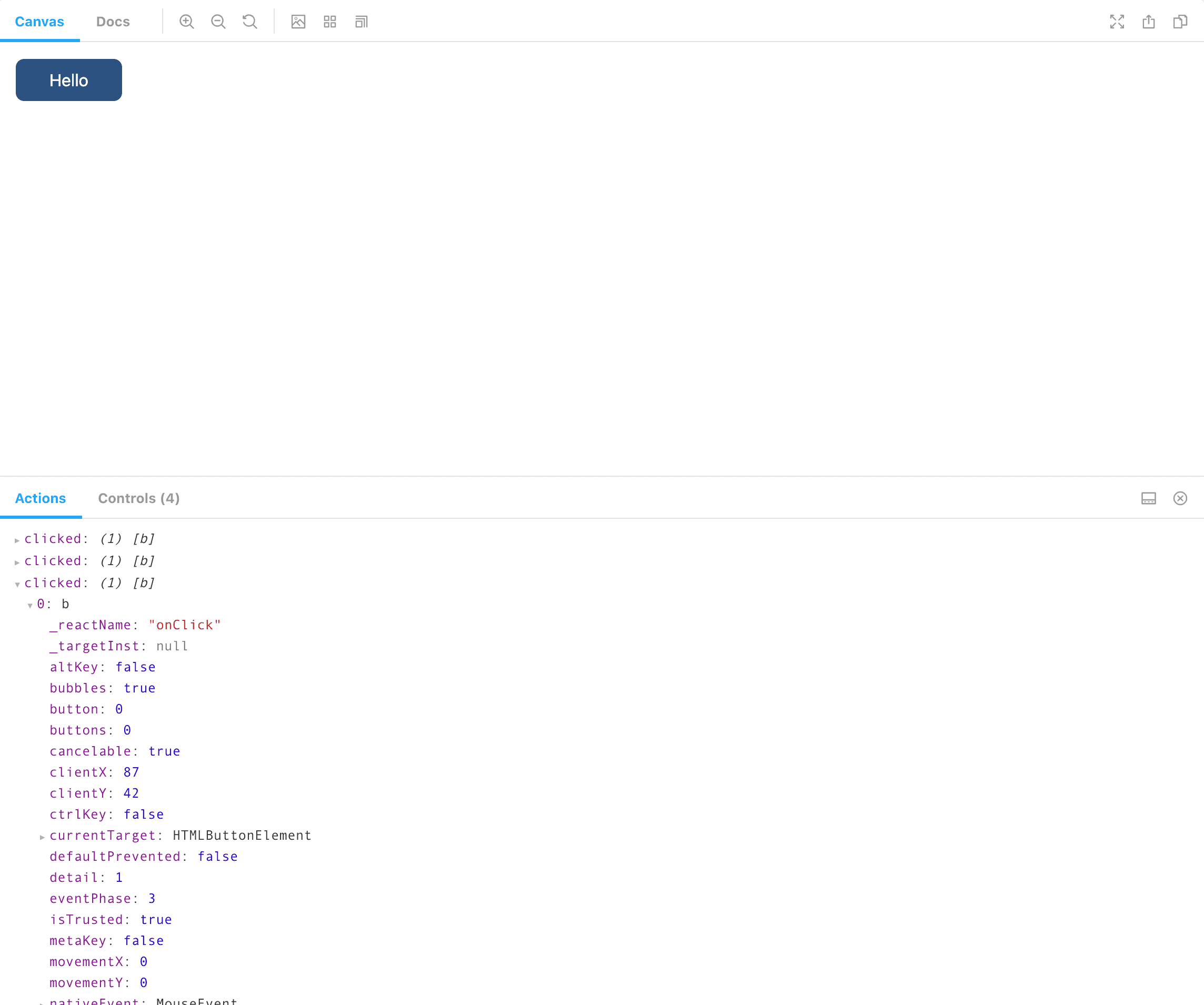
Adding "Actions"
That's pretty basic, though. Let's add an onClick handler and track those
clicks to make sure they work.
First we alter the Button component by passing an expected onClick
parameter through to the jsx+><Button> component:
// components/Button.tsx
import React from 'react';
export type ButtonProps = {  backgroundClassName?: string;  textClassName?: string;  className?: string;  onClick?: (event: React.MouseEvent<HTMLButtonElement>) => void; };
export const Button: React.FC<  ButtonProps & React.ComponentPropsWithoutRef<'button'>> = ({  className = '',  backgroundClassName = 'bg-blue-800',  textClassName = 'text-white',  children,  onClick,   ...props}) => (  <button    className={`rounded-lg py-2 px-8 ${backgroundClassName} ${textClassName} ${className}`}    onClick={onClick}     {...props}  >    {children}  </button>);
Then we modify the Button.stories.tsx file to account for the new onClick
handler:
// components/Button.stories.tsx
import { Story } from '@storybook/react/types-6-0';import React from 'react';
import { Button } from './Button';
const config = {  component: Button,  title: 'Button',  argTypes: { onClick: { action: 'clicked' } }, };
export default config;
const Template: Story = (args) => <Button {...args} />;
export const Default = Template.bind({});Default.args = {  children: 'Hello',};
This leverages Storybook's "Actions" plugin. As before, you can find much more information about how "Storybook Actions" work by visiting their documentation page.
After that code is in place, reloading the storybook UI and clicking the button will output some informative text in the "Actions" tab, letting you know that it was clicked. This is a great way to visually verify that your click handler is functioning as expected.
Playing with the "Controls" tab
You may have noticed the "Controls" tab next to the "Actions" tab. Storybook
controls are usually auto-detected by inspection of the component being
worked upon, if you're using typescript, then Storybook will inspect your
typescript+>type definitions to extract useful controls that can be
modified at runtime. If you're using vanilla JavaScript, then Storybook will
inspect any typescript+>PropTypes you provide.
If you click on the "Controls" tab, you should see that you can modify various properties on the component. Let's make the background of the component red.
Since this component uses tailwindcss to style things, we can simply add
the css+>.bg-red-700 class name as the backgroundClassName value. Once
that is done, the component updates live!
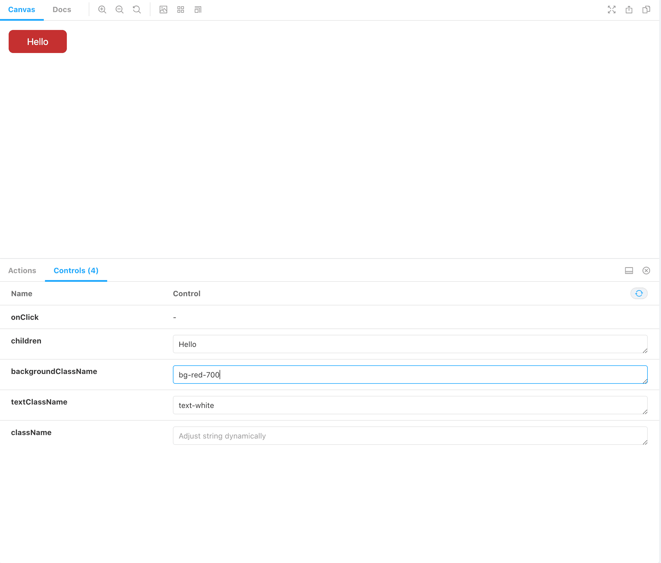
As you can see, the controls pre-populate with any default values from the
component, and any typescript+>string type fields will automatically be
rendered as text boxes for you to modify. This automatic detection will work
for almost all basic properties (booleans, numbers, arrays, objects,
enums, strings). It's also possible to create customized controls for more
advanced data types. Check out the
documentation for
a better writeup of how this works.
Conclusion
If you have been looking for a way to isolate your components, manage development of those components, and distribute documentation of those components to your team, Storybook seems like a perfect tool for the job.
At MachineServant, we have been using Storybook to some success. Keeping all our components housed in a components library with detailed stories for each component means that we have a very easy to manage and maintain component library that everyone has access to and can test with ease.
Combining this with bit.dev (https://bit.dev) means that we have a component library that can be worked upon in isolation while also having the ability to version control, package, and import our components into our projects.
I will be writing a follow-up blog post to this one that outlines how we use bit.dev at MachineServant. Combining Storybook and bit.dev has made our component library extremely flexible.

Are you looking for an efficient way to create and manage a component library? If so, Storybook and Bit are two great tools that can help. Both of these…

Wondering what the difference is between Storybook and Bit? This article breaks it down for you, so you can choose the right tool for your project. Sometimes…